A new brand identity for United Ventures
December 15th, 2020
During the last months, our in-house design and brand team, together with the team from Moze, worked to create a more consistent visual identity for United Ventures.
The day is finally here, and we’re officially announcing our rebrand!
But how did we get here?
The idea was to give the visual identity of United Ventures a new look that could represent everything that we have built so far, as well as the consolidation of a broader strategy, aimed at supporting founders in different phases of the entrepreneurial journey.
Since 2013 we have come a long way, and different logos have accompanied each phase of United Ventures’ story.
Our first logo was playful, colorful, and represented the union of different entities to create something innovative – which was exactly how United Ventures started.

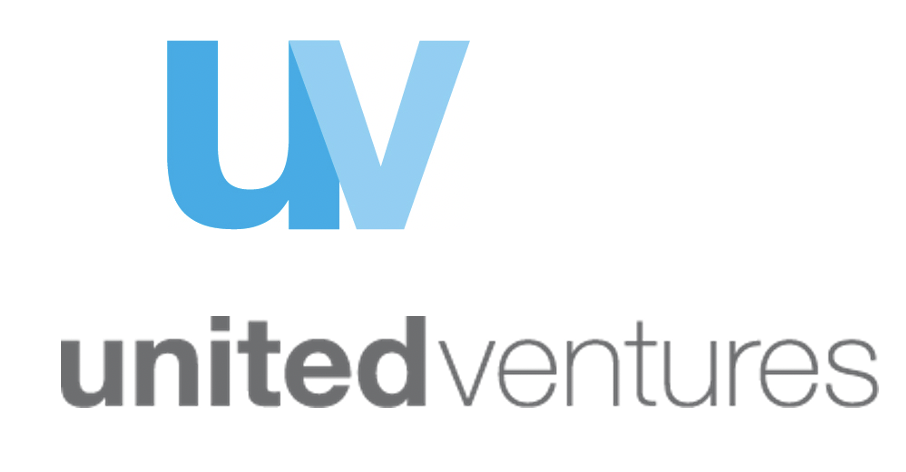
Then, we adopted our blue isotype UV, which quickly became an iconic mark.
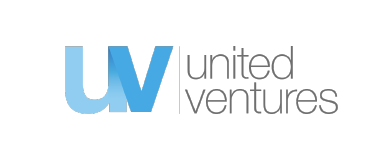
In the last couple of years, we experimented with a dual logo, alternating our classic UV with an extended horizontal dark grey logo. We liked the idea to play with two complementary logos that suited different needs, but in the end, we felt they were not fully expressing the evolution of United Ventures’ identity.
So, we started working on a visual identity that could represent us better, more distinctively and consistently. We wanted the new logo to connect what United Ventures has been so far, what it has built, with its future and its ambitions.
It was challenging to find the most effective way to tell and represent this evolution, bringing the identity of United Ventures to the next stage of its history, to the next level.
We explored a range of possibilities until we found the right one.
And here it is…!
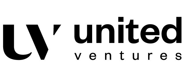
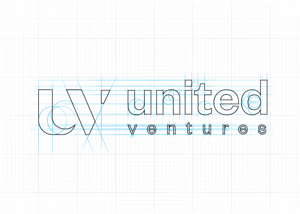
As you can see, the new United Ventures’ logotype combines two contrasting typefaces to convey the overlap between tradition and innovation. There were different needs to balance and reconcile, and that’s why the new logo contains at the same time elements of continuity and elements of discontinuity.
Our iconic UV is still there
as an element of continuity with the history of United Ventures. It is a symbol that has a lot of strength and simultaneously is very versatile. Nevertheless, we have given it a more contemporary look.
We are even more UNITED
and gave greater prominence to the distinguishing element of the brand. This adjective holds the essence and history of the fund. It truly represents who we are, our company culture, our DNA.
We have gone B/W
and dropped our blue as an element of discontinuity. It was a rather difficult decision because we were all very fond of our blue, but giving it up was the only way to go beyond and give the sense of a real change of pace.
Colours & Typography
Black and white are the foundational colors of the new visual identity. We believe that they create a clean, elegant line.
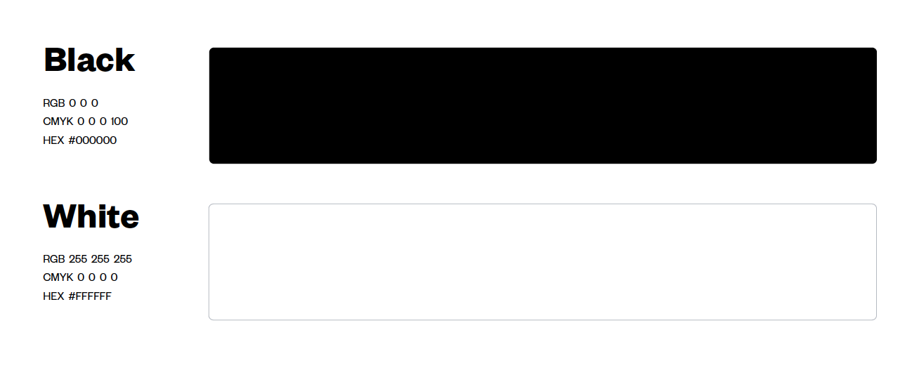
To compensate for blue abandonment, we have identified a palette with a very lively and intense secondary scheme that balances the essentiality of black and white. Our blue was the chromatic starting point in the creation of the palette.

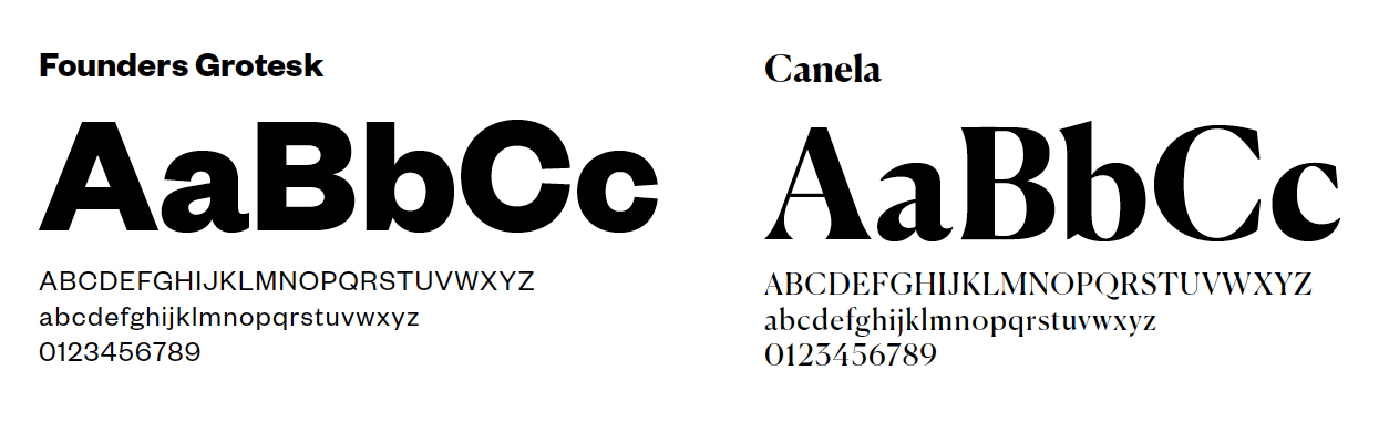
The new visual identity is strongly marked by the play between these two opposing drives: past/future, tradition/innovation. The same dialogue inspires our typography: we have chosen Founders Grotesk as the primary typeface of our renewed brand identity and Canela as a secondary choice.
What else? We hope you like our new brand identity as much as we do!
While not straightforward – as usual in the design path – this exciting journey has given us an excellent opportunity to reflect upon United Ventures’ values and culture and rethink its vision and mission ahead.
We believe that the outcome neatly represents what the team of United Ventures has built so far in support of entrepreneurs, portfolio companies, partners, and investors.
At the same time, it highlights the new path we are taking as a company – with a growing team, an expanding footprint, and an accelerated investment roadmap.
If you’d like to learn more about the design from Moze themselves, read their blog post here.